The assignment:
For this project, we looked for a shop in Amsterdam that we wanted to help via webshop optimisation. We are building a new website for the business, which we believe will have a positive effect on the shop’s clientele. The users of the current Daskas website are not intrigued enough to stay on the website. They buy few to no products, as the site is too difficult to navigate and visually unappealing.
The result:
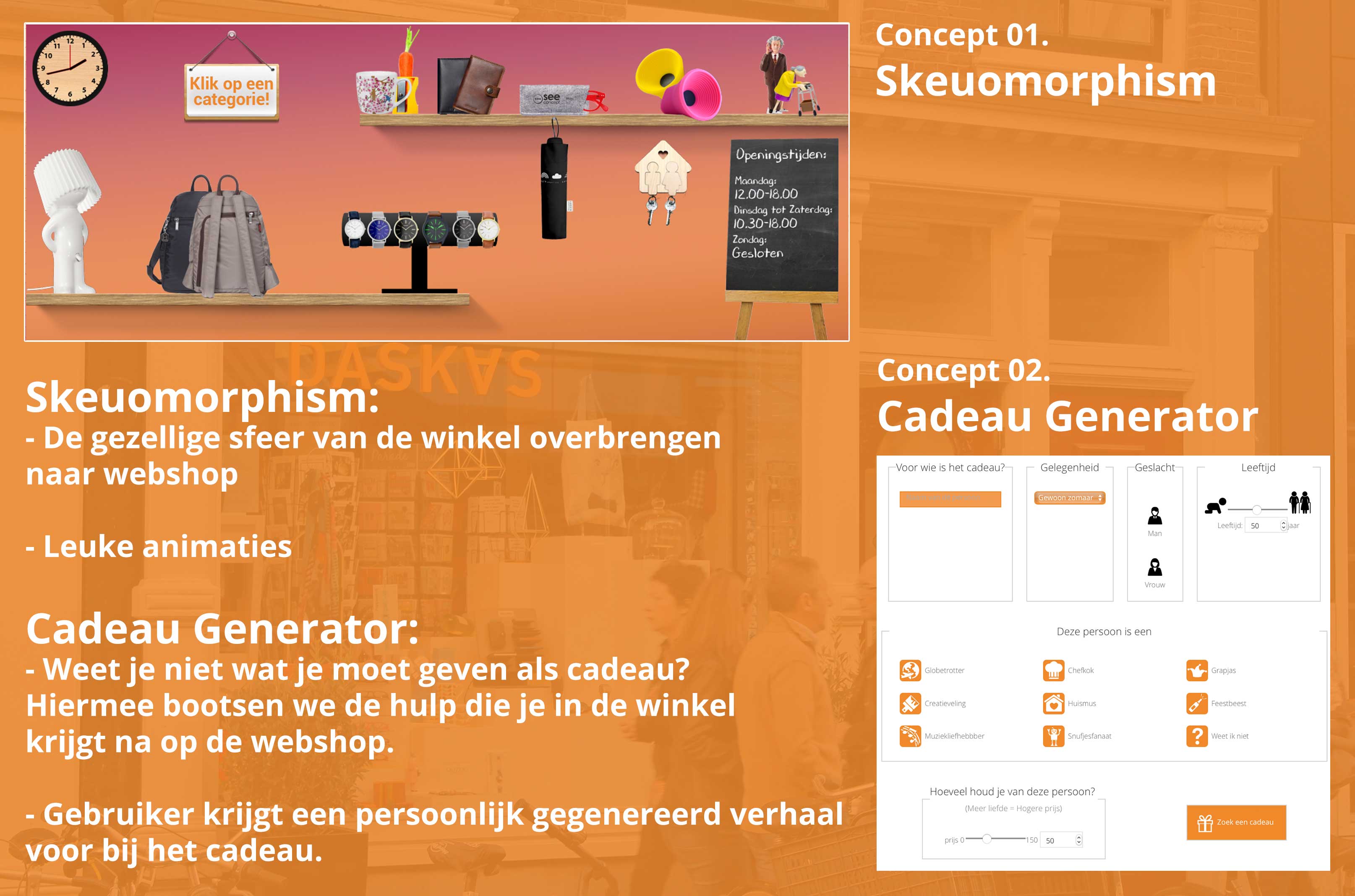
Our website has two main concepts:
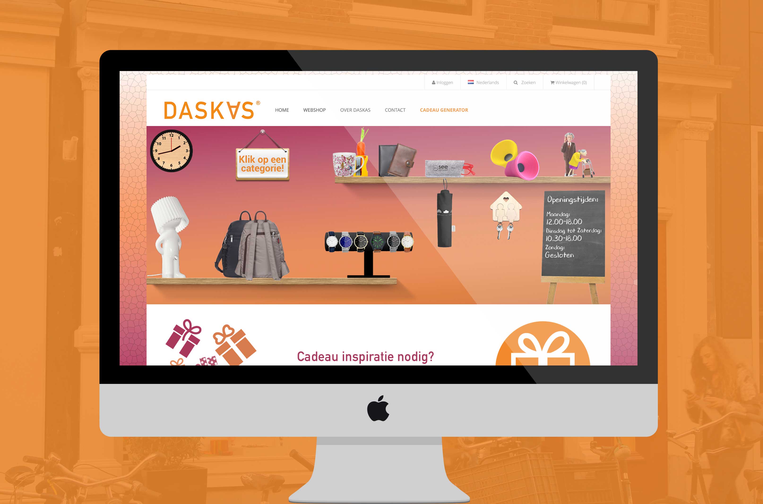
Concept 1 – Skeuomorphism: We incorporate skeuomorphism, which means that the webshop resembles a display cabinet in the shop or shelves containing products. This makes you feel as though you are inside the shop itself. As it recreates the shop’s vibe, the website quickly gives you a familiar feeling. Each item is displayed on a shelf, representing a category to which you can navigate via entertaining animations.
Concept 2 – Gift Generator: Helping customers to find gifts is another way for Daskas to differentiate itself from its competitors. The target- roup research in particular showed that the users often don’t know what they want or need to buy for others, and as a result they often search aimlessly for gifts both online and offline. Users fill in the gift generator and are given a suitable gift suggestion with a personally generated back story. The site will officially go live at the end of February!
Promo video:
The paper prototype test:
Explanation of new webshop:
Link(s) to additional project info/demo(s)/film clips:
http://www.daskas.nl
Images:


